

Online browsing experience is the most critical factor required for any online business today. If a website is hard to figure out because of poor navigation menu or incorrect links, they will click away never to return. While website navigation menu seems like a minor part of the website, it can play a major role in making or breaking your online business or personal website because it directly deals with the entire UX or user experience. In the current scenario, majority of the web surfers browse through their mobile devices and therefore website designers have to think of how to condense massive navigation menus without losing its UX factor, value, and purpose.
Although this sounds like a herculean task at first, there are ways to condense the navigation menu when done the right way.
Plan What’s Important for Your Brand
Do you really think every page on your current website is important? If no, you can remove those pages and keep only what’s important for your company and brand’s presence. If yes, you may want to consolidate and pair down multiple pages into one without losing the crux of your website or the message you want to put out as a brand. An effective navigation menu usually has five main navigation tabs with a single sub-menu column (never try the sub-sub menu) under each of those tabs. You may want to talk about the amount of content with your website UX designer to reach a better conclusion.
Decide Which Style Suits Your Brand
How your website appears to the online visitors is equally important?
Hence, there are various styles and design that you can choose from when you are building your website. To begin with, if you are unwilling to take any chances, the standard top navigation menu that offers a breakdown of related sub-menus is the best bet. The top navigation menu might seem like a conventional menu, but offers better UX functionality and excellent browsing experience to your online visitors. Web designers can add design factor to it, to make it more appealing.
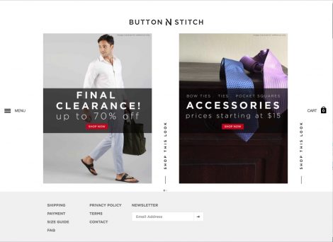
On the other hand, the parallax menu style has gained lot of appreciation and recognition in the past few years. One of the best features of parallax UX menu is that it offers more visual space, especially if your website has large high-definition images. This is usually ideal for websites where you have less amount of content and less number of menu options.

The block menu works like a tile UI where multiple options provided by the organization are neatly arranged in a tile shape navigation menu with images. It offers a better UX experience as users can browse through the information and segment they are interested in rather than looking for options.
There are other popular minimalistic navigation menu styles that you can find online and decide which one suits your business website.
So, What Makes a Good Website Navigation Menu?
Keeping your site simple and easy is a great way to optimize it and to attract more online visitors. The most important question that you should ask yourself is ‘’what experience do you want your users to have?’’ When you have an answer, use this information to create and pick styles and options that allow users to browse through your website effortlessly. Your website navigation menu must offer the right user experience through better UX design and content. The menu structure should be able to guide the user and lend itself well to the content. StratAgile offers expertise in multiple programming languages and environments and assists website owners in designing and developing the web and mobile platforms using sophisticated technologies. Do you think your website navigation menu is not up to the mark? We can offer you the best suggestions and ideas that suit your business requirement and goals. Visit our website now.